
Regardless of which page you’re optimizing, your primary CTAs (e.g. Add to cart, Checkout, Sign up) should stand out to a buyer that’s scanning the page. Create a natural flow for their eyes, like waypoints in a GPS app, to your key CTAs.
Reflect on what the main objective for the page is
Each page has a primary action or actions that you want your visitors to do. For instance, product details pages aim to drive visitors to click Add to cart, while the cart page drives visitors to click Checkout. Your homepage and other pages may have more than one objective.
Focus on the objectives that are most important to you for that page and brainstorm how you can make the related CTA stand out on the page. Don’t let other page elements distract from or bury those CTAs. Try out different styles, verbiage, and placement to see what works best for your customers. Keep it simple.
Experiment with different designs
You want to avoid letting the key CTAs blend in with other CTAs and the page itself due to poor contrast or due to design choices. Make sure that when the customer is ready to engage, they know exactly where and how to do so.
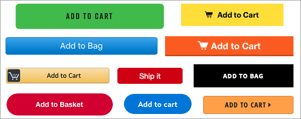
Try different colors that contrast the background:
You’re looking to have the button stand out. One of the best ways of achieving that is to run colors that have high contrast against the background. Generate variations with a few different options to see what resonates with your audience. Keep in mind that you may want to also change font colors to compliment your new button colors.
Examples:
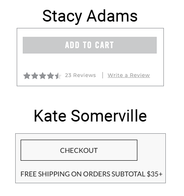
Low contrast / does not stand out:
These example CTAs use a gray, subdued color that blends in with the other page elements, which are also gray.
High contrast / stands out:
These example CTAs use a bright color that makes them pop against the rest of the black and gray page elements.

Try different shapes, sizes, and effects:
- Shapes – The shape of your CTAs might make a difference. Try different designs.
- Sizes – Try out different button sizes. You want it large enough to stand out but not so large it overwhelms the page.
- Effects – Test different effects (e.g. drop shadows, outer glow, border, banner, include icons within the button, etc).

Experiment with different phrasing
What your CTAs say can be as important as how they appear. Your visitors might respond really well to a certain phrase or tone and be less engaging with others. Try different types of text/language to uncover what works and what doesn’t.
- Alternate keywords and phrases
- Shorter phrasing vs. longer phrasing
- Neutral verbiage vs. aggressive verbiage
Example of alternate keywords for an Account creation CTA:
- Sign up
- Register
- Join now
- Sign me up
- Create an account
- Become a member
Experiment with different placements
Brainstorm what areas of the page may help showcase important CTAs. You don’t want to make your customers hunt for the Add to cart or Checkout button, for instance. Make sure the CTA is visible (above the fold) when visitors land on the page.
- Put important CTAs front and center.
- Using non-invasive pop-ups for things like promos.
- Test different locations on the page, for instance:
- Above or below the product details
- Near the product images
- Below a set of options (e.g. shoe size)
Consider how you want the CTA to react as a customer scrolls on the page:
- Static – Add the button to the page statically. If you scroll past the button, the button is no longer visible. If the page is long, consider repeating the button at the bottom.
- Floating – Begin with the button floating on the page. As you scroll, the button stays in place, while the page beneath it scrolls. Could be a floating button or banner.
- Static to floating – Have the button begin statically on the page. As you scroll past the button, the button becomes floating and stays visible as you scroll.
Consider what content should surround the CTA
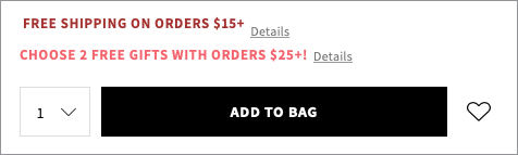
The area surrounding certain CTAs, like Add to Cart, is a prime place to showcase options, offers, and security features. Reflect on concerns customers might have or what you may want to promote as they’re considering clicking the CTA.
Options and offers:
As the customer is thinking about purchasing this item and looking at the Add to Cart CTA, their eyes will naturally be drawn to the area around the button. Consider highlighting:
- Options (e.g. quantity or auto-renew)
- Offers (e.g. free shipping, free returns, or “Add XX items / more than $XX to the cart to get [benefit]”)
Example: e.l.f. Cosmetics
Security:
Some customers like to be reassured that their transactions are done securely. Consider adding a “secure lock” type icon with some language ensuring that transactions with you are safe and/or that you don’t share their info with any third parties.
Example: Amazon

Talk to sales.
Start converting more leads today.
.webp)
.webp)
.webp)
